free html web templates

Data Science Portfolio & Consulting Services

Welcome! I'm Jon MacKay, a data scientist and analytics consultant specializing in transforming complex business challenges into actionable insights.

What You'll Find Here

This site serves as both a demonstration of my technical expertise and a window into my problem-solving approach. Each case study showcases real-world applications of data science techniques I've employed.

Featured Work
Below you'll find a curated selection of technical examples that showcase my approach to data analysis. Each project includes detailed documentation and often code samples, demonstrating both technical proficiency and business acumen.

Pedestrian collision

Do Speed Cameras Really Prevent Pedestrian Collisions in Toronto?

Traffic safety is a critical concern for any city, and speed cameras have long been touted as a solution to protect vulnerable road users. But do these electronic watchdogs actually make our streets safer? In this deep dive into Toronto's speed camera program, I uncovered some surprising—and disappointing—findings.

Traffic accidents in Kitchener

Pedestrian and cycling accidents near schools in Kitchener during school hours. What does the data say?

Will speed cameras near Kitchener schools make any difference? A project involving data analysis and visualization.

Should Kitchener-Waterloo implement speed cameras at all Public and Catholic Board schools in the Region? I looked at traffic collision data from the City of Kitchener and found little evidence that speed cameras would provide much value. First, there are relatively few accidents near schools during school hours involving pedestrians (an average of about 4.7 accidents yearly). In Kitchener, the majority of accidents have occurred at intersections near downtown schools or Williamsburg. I suggest that traditional traffic calming measures – speed bumps, crosswalks, and crossing attendants – provide citizens with better safety and value. 

KW Road Network

A map of the busiest roads in Kitchener-Waterloo according to a network simulation.

Will Community Safety Zones Change How We Drive in KW?

Kitchener and Waterloo are considering a dramatic change to our roads: automated speed cameras at every school, creating "community safety zones" with 30 km/h speed limits. Any speed above that—yes, even a single kilometer over—could earn you a ticket in the mail. In this posting, I’m going to focus on this question: what will this do to our driving patterns?

TFWP Dynamic Visualization

Visualizing policy data

This example data visualization uses R leaflet and open data from the Canadian government detailing the Temporary Foreign Worker Program (TFWP). Over the past few years, the TFWP program has been controversial -- the UN recently critized it for creating conditions ripe for modern slavery. I take no position on the matter, but present the data from Q1, 2024 in a visualization so you can make up your own mind

College scene

Wage Analysis of Employees at Ontario Public Colleges 

First, a visual analysis of the wages paid to executives and employees at Ontario colleges. The data is from the Ontario Sunshine list.

Second, a more in-depth analysis based on inferential and predictive machine learning models. The models and visualizations are done in R.

Cloud work

See google cloud text analysis program

Google cloud programming

This Python Google Cloud application I wrote is a Docker app that can be run as a CloudRun service. It will authenticate to one's Google services (GMail or Google Drive) and read a series of documents/emails you specify. It will then conduct a text analysis and cluster the documents into thematic groups. The program generates a series of detailed visualizations and data files that can be downloaded and used for further analysis.

Telecommunications patents

Data analysis: telecommunications patents

This is a small part of an old research project. In this Python Jupyter notebook, I examine and visualize telecommunications patents from the USPTO. This is interesting because it shows the growth of international players, especially the Chinese (Huawei, in particular) over the past 15 years. 

Huawei topic modelling

Topic modeling examining the Huawei brand

Examines changes to people's perception of Huawei in a series of Jupyter notebooks. This too was part of a research project.

IO Table

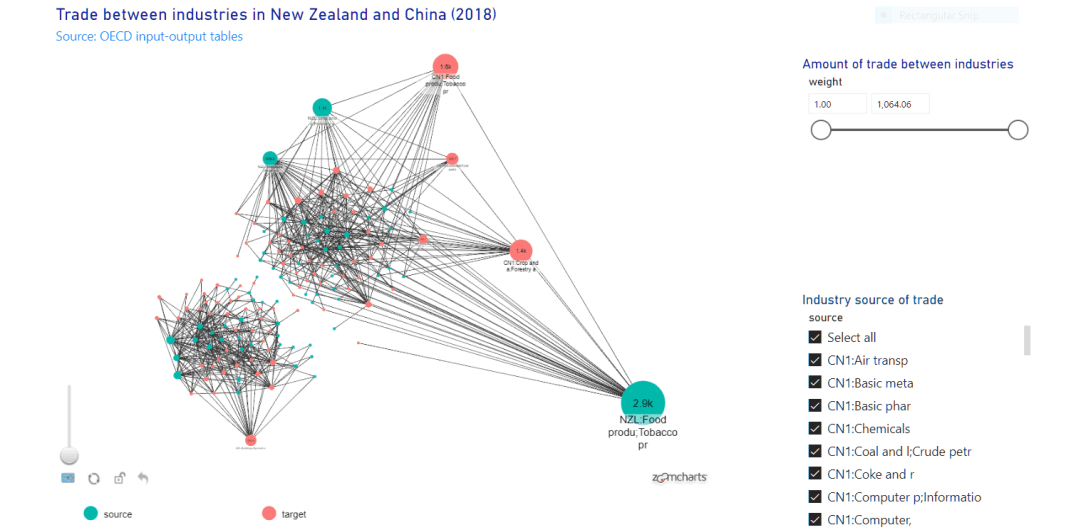
This shows the economic relationships between different industries in New Zealand and China. The Power BI visualization allows for dynamic exploration of the graph.

Power BI - Data viz

I often work with networks. I thought it would be fun to create a dynamic visualization of the economic relationships between industries in New Zealand and China. The visualization uses OECD data from the international input output tables to show those ties. 

You can see the dynamic visualization and read more about my process here.

Bass forecasts

Using the Bass Model to Forecast Sales

This project shows how different kinds of communication goods ranging from newspapers to mobile phones were adopted in the USA and Canada. A Bass model is used to forecast sales for each good. A discussion shows how innovative consumers help sales relative to consumers that imitate others in their purchases. The historical data shows that modern consumer goods like personal computers and mobile phones have strong network effects that encourage consumers to purchase compared to other kinds of communication technologies like radio, newspaper or television.

Examples from corporate work

Follow the link for descriptions of some of my previous work-related data science projects

Contact: Jon MacKay