Return to work portfolio main page


simple website templates

Input-output tables showing New Zealand trade

A visualization of New Zealand's trade with China using Power BI to display and Python to wrangle the data.

Network

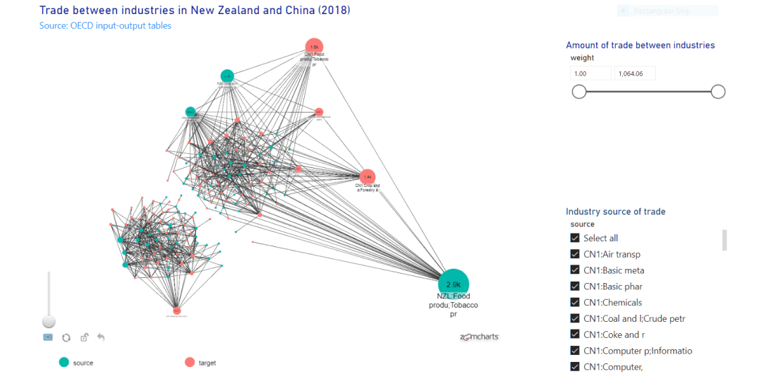
This shows the economic relationships between different industries in New Zealand and China. The Power BI visualization allows for dynamic exploration of the graph.

Economic networks

I often work with networks. I thought it would be fun to create a dynamic visualization of the economic relationships between industries in New Zealand and China. The visualization uses OECD data from the international input output tables to show those ties.

You can find a link to the dynamic visualization here.
Here is a PDF copy of the visualization. The source Power BI file is here. 

Background: Input-output tables

Input-output tables capture the flows of goods and services between different industries in the economy. In advanced nations, national statistical agencies are charged with recording these flows. The end result can be used to determine the critical industries in a country. More recently, IO tables have been the source data used to estimate the amount of greenhouse gases produced by the industries in a country.

The OECD provides IO tables for many countries and includes trade flows between industries in different countries. This data is freely available (https://www.oecd.org/sti/ind/inter-country-input-output-tables.htm). In this exercise, I use this data to generate a network data visualization of these graphs. 

adjacency matrix

Figure 1: A network from an adjacency matrix (Source: http://www.btechsmartclass.com/data_structures/graph-representations.html)

Data - Adjacency matrix

IO Tables are stored as an adjacency matrix. Each column title is an industry. The first row also is an industry. The cells of the matrix represent the value of the flows of goods from one industry to another (i.e., the industry in the row to that listed in the column.) Reading across the rows and columns shows the value of the flows of goods between industries. We can use a graph to visualize these flows. 


When people talk about graphs/networks, they usually speak of nodes and the edges that connect them. Nodes are often distinguished as being the source node and the target node that are connected by an edge. For example, Figure 1 shows an edge from the source node A to target nodes B, C, and D but not from A to E.


Getting the data to Power BI

Power BI can display graphs, but it requires the data in a different format. Technically, I could do the data munging in Power BI, but some extra data cleaning steps are more straightforward in Python. Here is the data processing script in Python (I changed the extension to .txt so my webserver displays it). 

This script loads the global adjacency matrix (i.e., trade between all industries and nations) and then converts the data into a long format. Most network visualization tools prefer data to list the edges between nodes. The IO Tables generally only have the industry codes in them. The script also merges in human-readable data from another table.         

You can configure the script to read the IO Table and extract data for one or more countries. You can also set a threshold on the amount of trade so you can see more or less essential industries. The Power BI dynamic visualization allows you to adjust these weights.
 
The script allows you to display the input-output relationships between one or more countries. You can also easily filter by the value of trade between industries so you can easily see the most important export and import industries in each country.


NZ and China trade

Figure 2: Inter-industry trade between New Zealand (green) and China (red). This visualization shows only the industries that engage in direct trade between the two countries.

Results

Although the input-output tables are not often examined in this way, we can see that the network visualization approach yields some valuable insights. Figure 2 focuses only on the inter-industry trade involving New Zealand and China. For simplicity, we omit all the domestic interconnections within both countries.

We can see that New Zealand's primary export to China is the Food industry, which supplies Chinese food production, food, and accommodation. New Zealand's forestry industry is the next largest exporting industry to China. Its exports feed into Chinese crop and forestry, wood and food products industries. In each case, it is likely that Chinese industries are utilizing New Zealand imports as inputs for their own products or, in some cases, selling directly to consumers.

The network also shows that the Chinese crop and forestry industry supplies inputs to the New Zealand food products industry. Chinese industry also imports chemicals, textiles, and leather goods, but not at the same scale as New Zealand's largest export industries. 

Power BI


Return to work portfolio main page


Contact: Jon MacKay